Thank you for dropping by on your phone! To ensure a better viewing experience, you
might need a
larger
screen (a.k.a. your desktop) to look at my protfolio.
RaceClocker is a do-it-yourself tool for
manual timing of sports races. Its goal is to provide coaches, race
managers, and time keepers with
accurate and high-quality race timing
service.
We were given the task to improve the user experience of RaceClocker. As our
client, Cees
van Dok (the founder of RaceClocker)mainly saw this
project as a source of inspiration for future
iterations, the technical constraints were lifted and bold concepts were encouraged.
Of course, if I were optimizing the real product,
I would also consider the
negative
influence brought by the changes on the product (e.g. confusion caused by drastic changes in the new
design) and take technical feasibility into account. I would also refer back to the company’s
roadmap,
to think about whether the new design is necessary for both its users and the business. Now
that the aim
is for envisioning the product in the most ideal state, we, therefore, left off those concerns and went
for the best at full force.
My roles
Product analysis and usage evaluation
I conducted product analysis and usage evaluation to generate insights about the
current product design.
Planning and scope definition
I facilitated the brainstorming session of conceptualization and prioritized the
concepts for further development.
Design execution and validation
I executed the user journeys, wireframes, prototypes, and design specs. I
coordinated the user tests for validation.
Leadership and communication
I led the group working drumbeats and facilitated the meetings with the client
and mentors.
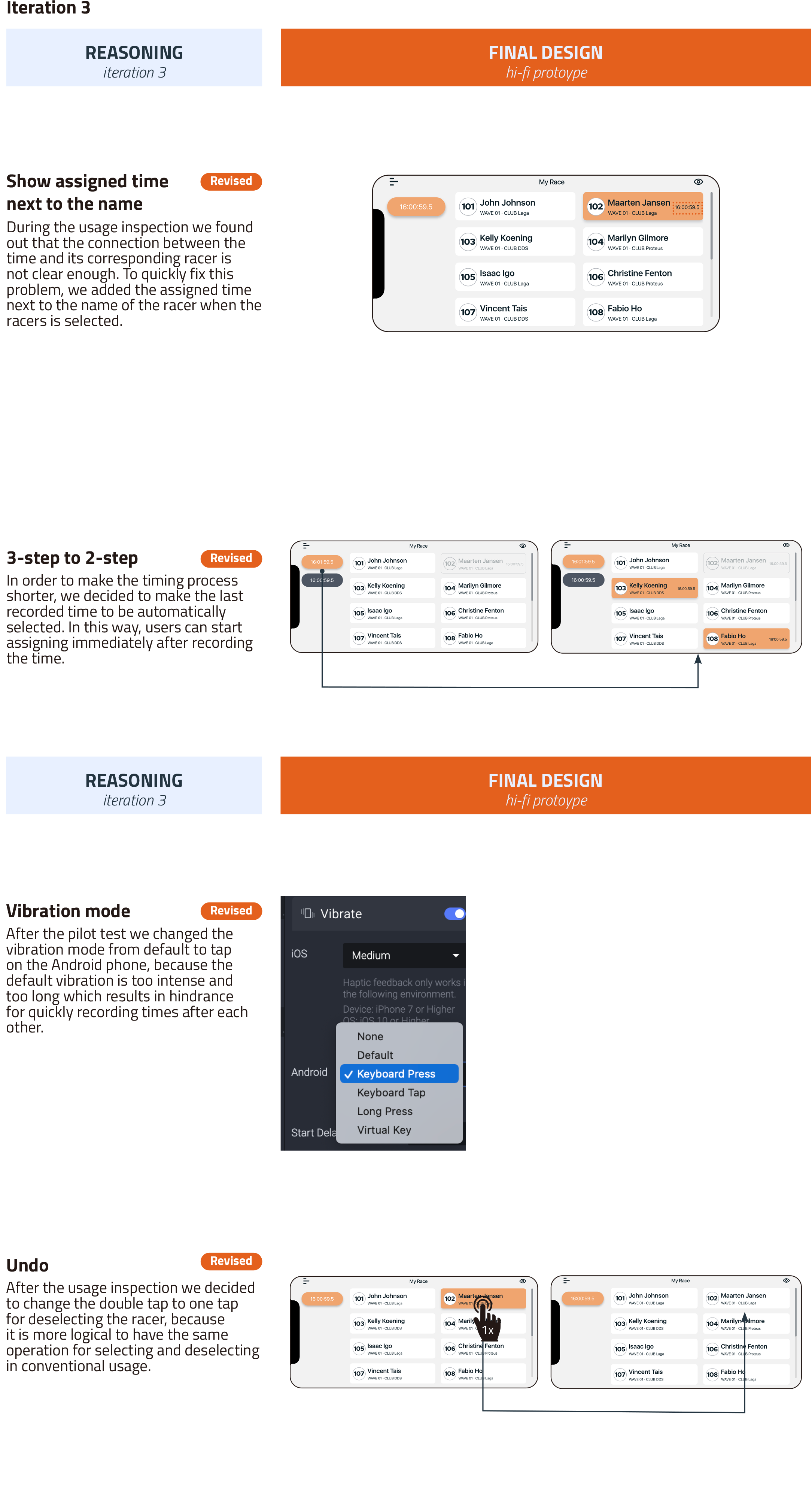
discovery
problem statements
By integrating the findings from first-hand experience, online reviews, interviews, and
methodical usage inspection, we summarized the following 5 problem statements:
The RaceClocker app’s current confusing hierarchy of pages
causes getting
lost in navigation among
users
Users might easily get lost in many pages due to a complicated use
flow
The user receives no clear
feedback after clicking a button or icon.
Unclear meanings of buttons
or icons cause misunderstanding or confusion
During timing, the eye-hand coordination is hard and timing can be stressful
due to difficult
operation on the product
vision
bridge the gap between digital timing and physical tracking
"We want to
make frequent
users feel in control when using RaceClocker.
Time
recording during a race should be intuitive, efficient
and fast. Besides that,
users should feel confident when using and navigating through the functions
RaceClocker offers."
solution
introducing RaceClocker 2.0
Flatten the hierarchy by collecting the non-often-used features in the menu
We aim to keep the hierarchy of
timer dashboard simple and flat by
1) reducing the unnecessary digital
buttons and collecting not-often-used
features in the menu; 2) making the
main interactions happen on the same
interface and avoiding unnecessary
jumping.
Smoothen the use flow by replacing choice-making with automatic recommendations
We intend to smoothen the use
flow by limiting users’ choices. For
example, we recommend timekeepers
to choose the timing mode that most
suits the race beforehand, which helps
to offload the pressure of choosing
the best timing mode and also avoid
distractions when keeping track of the
time during the race.
Boost the feeling of control by providing multi-sensory feedback
We use various types of output as the
feedback, including the visual feedback
(the color changing) and the haptic
feedback (the vibration of the phone).
We carefully designed our color code
to make it intuitive. We also decide the
form of feedback according to the level
of importance and the context. For
example, during the phase of timing,
we provide visual and haptic feedback
as a double confirmation of certain
actions. After timing all participants,
a pop-out window will show the
timekeepers they have already finish
their job.
Improve visual clarity and consistency by standardizing the design guideline
We standardized our design according
to a set of UI design guideline, which
includes the size of eachibutton, the
color code, the font and font size, and
the state changing code. We set up the
guideline to make sure each element
on the interface is clearly presented,
logically laid out at the appropriate
location and also meets the aesthetic
need.
Enhance eye-hand coordination, and operation by using the hard key of phones
We got inspired by the use of
the
stopwatch during timekeeping - a
traditional but efficient way of
timekeeping without the problem
of operation - and decided to use
the hard keys of the mobile phone
to replicate the familiar feeling of
timekeeping with a stopwatch thereby
solving the problem of hand-eye
discoordination.
A proper scoping is based on a thorough understanding
Since the design brief is quite broad and vague, one of the many challenges is how
to
properly define the design scope. The foundation of scoping is a thorough understanding of the
product.
We used the following framework to retrieve different cross-sections of the product.
Product analysis framework
Design directions emerge from formative evaluation
In order to ideate solutions to improve the usability of RaceClocker, we used
various
methods including first-hand experience, online reviews, interview, methodical user involvement usage
inspection, etc. to conduct the formative evaluation to know how to make the usability improvements.
discover
Understanding RaceClocker: What are we dealing with?
To better understand the what-is (not what is good/bad), we conducted several research
activities in parallel. The main takeaways are
summarized below. Expand each part for more details.
On 16th February, we had a meeting with Cees van Dok, the founder
of RaceClocker to gain a deeper understanding of RaceClocker from the founder’s perspective.
RaceClocker is a one man
business and
was started and developed 8 years
ago, initially as a hobby. The owner
and builder spends about three weeks
a year improving this online timing
platform. RaceClocker has no other
products or applications.
It is usually used in
various scale races
for small clubs or events. And it
also
provides highly efficient timing process
for many sports on water or snow or at
remote locations.
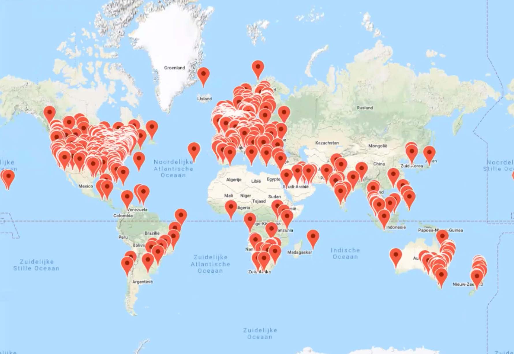
The users of RaceClocker displayed on a world map
RaceClocker has 3000 active users and has been used for more than 10.000
events. These users and events are
located all around the world. Compared to other online timing
platforms, with a whole team behind
it, RaceClocker’s position in the market
is quite leading.
The founder is eager to get more critical feedbacks. For
redesign, we were requested to focus on crucial and prevalent needs first. We should try to improve the usability for
unprofessional users. We should keep the recognizable visual style. Some of the
terms are used differently in different places. They should be well-defined to avoid
confusion. We should avoid the clumsy click-here-and-that type of first use guidance.
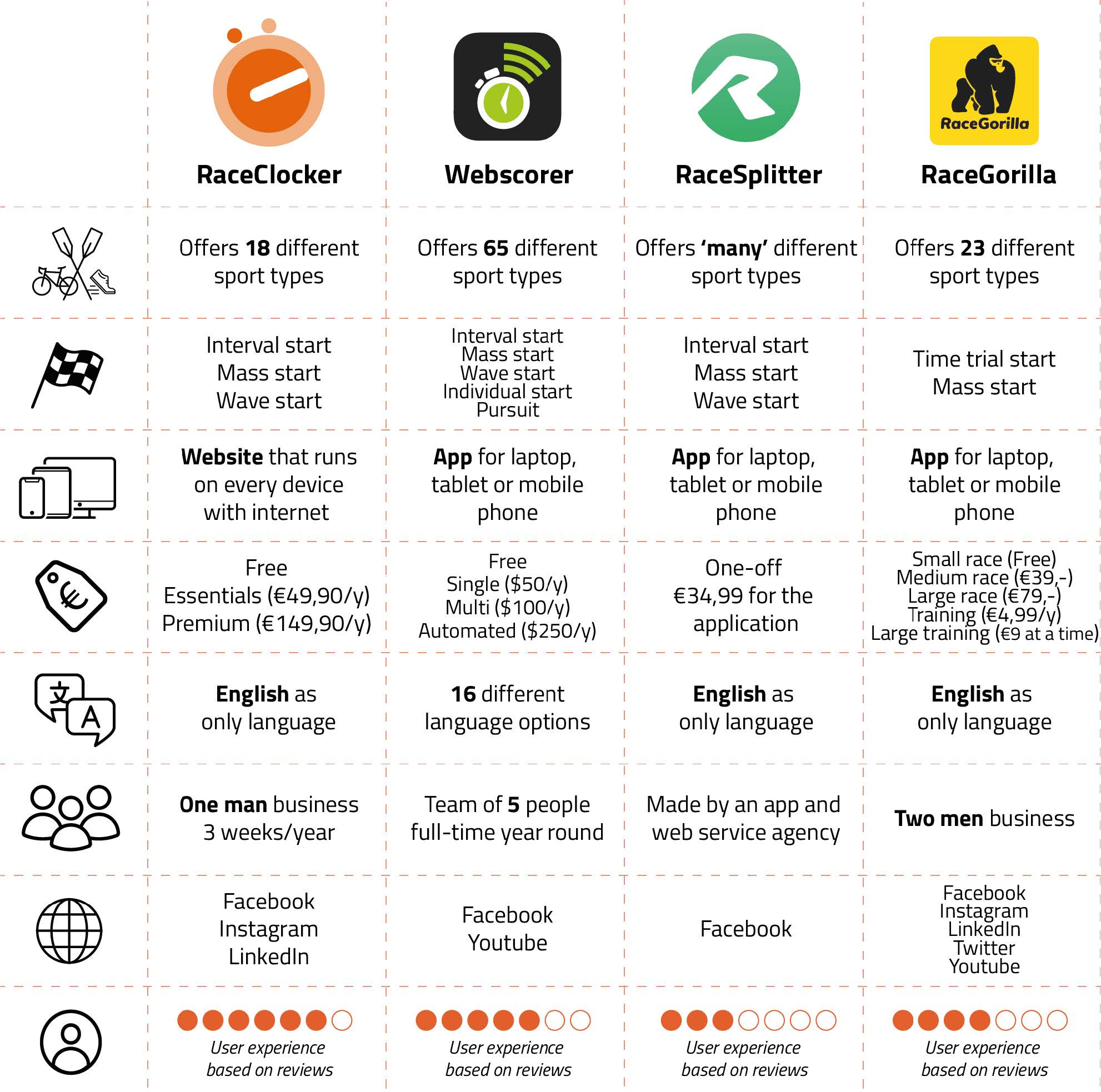
In order to get an overview of
RaceClocker’s competitors, we created
an account on the three most similar
timing platforms and simulated a
race. The three main competitors
are Webscorer, RaceSplitter and
RaceGorilla.
An overview of this
competitor analysis is shown with
some general data. Comparing this
data has led to many insights that
are not necessarily valuable within
the scope of our project. However,
it was very interesting to try out the
interfaces of the different applications.
At first
sight, they all looked more complicated
and kind of out-dated in comparison to
RaceClocker’s application. Researching
the reviews and interactions of the
apps, we concluded that RaceClocker is
actually doing well in this niche market.
It has a user-friendly interface, looks
professional and the communication
with the developer is fast and clear.
However, the learning curve is still not
optimal and the user does not feel
confident about timing a race.
Competitive analysis overview
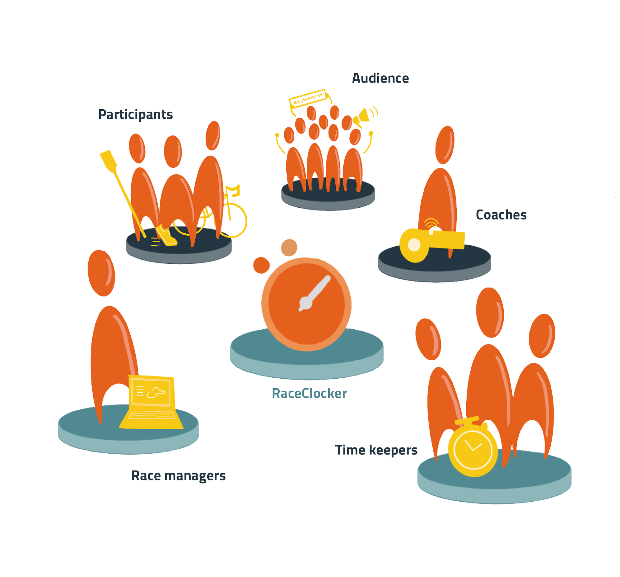
We identified five user groups (Figure below) in the ecosystem of RaceClocker.
We
divided these groups into direct and
indirect users.
Direct users of RaceClocker are race
managers and timekeepers. Race
managers create races and collect
and enter all necessary details such
as date, time, location and participant
lists. Timekeepers register the exact
time participants pass their start,
finish or split point during the race. Indirect users are the sporters - the
participants who join the race - and the
audience viewing the race, in real life or
remotely. RaceClocker offers real time
result sharing, enabling participants
and audience to see performances
directly. Furthermore, sport coaches
can also use RaceClocker as a tool to
compare performances within training
sessions.
User Groups of RaceClocker
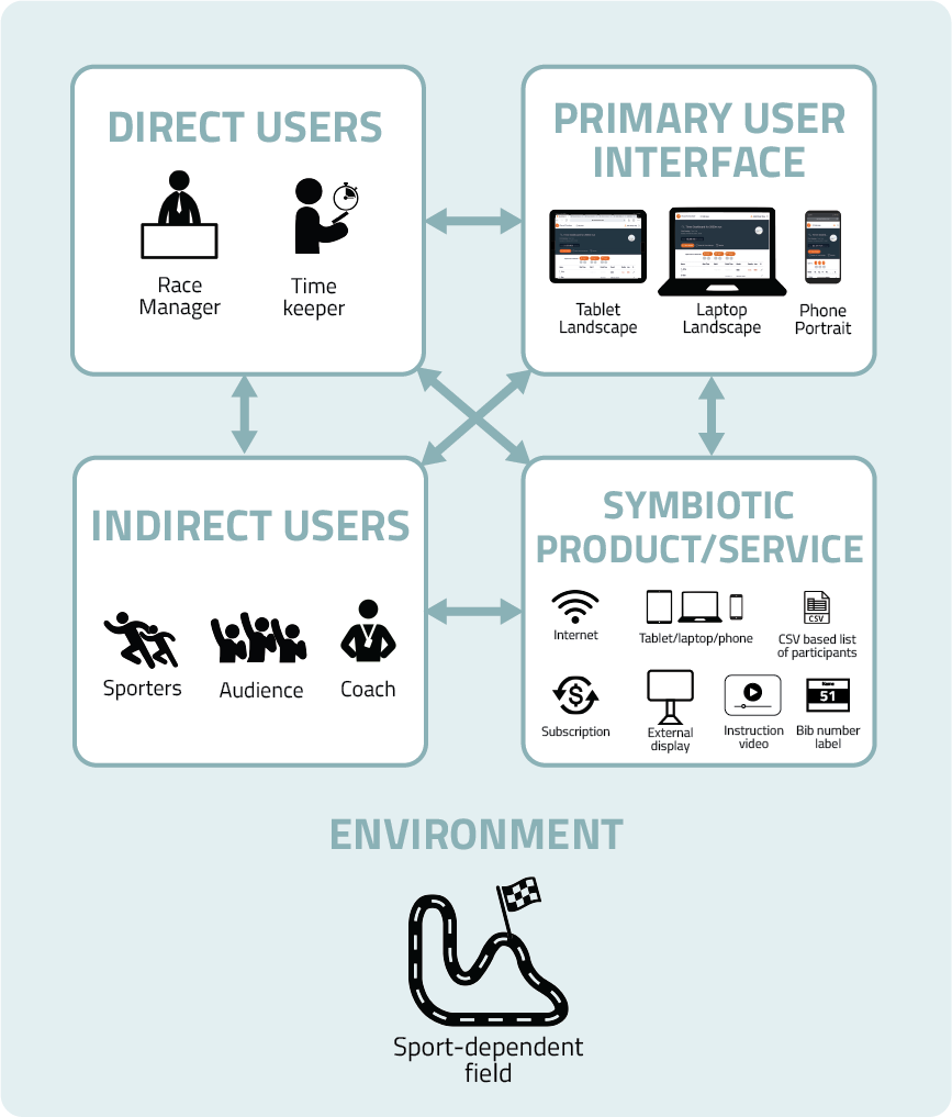
RaceClocker can be used on laptop, tablet
and smartphone. Figure below shows an overview of the primary user interfaces
within each device. Symbiotic products, such as internet connection or BIB/
BOW numbers to recognize participants, are also relevant within the use of
RaceClocker besides the primary products. Finally, the environment where
RaceClocker is used, depends on the sports type and club’s preference. Before
the race, RaceClocker is used by the race manager in the office, to create a race
and import race information and details. During the race, RaceClocker is used by
timekeepers to track participants, in both indoor and outdoor spaces and by race
manager to keep an overvie of the race and share results.
Ecosystem of RaceClocker
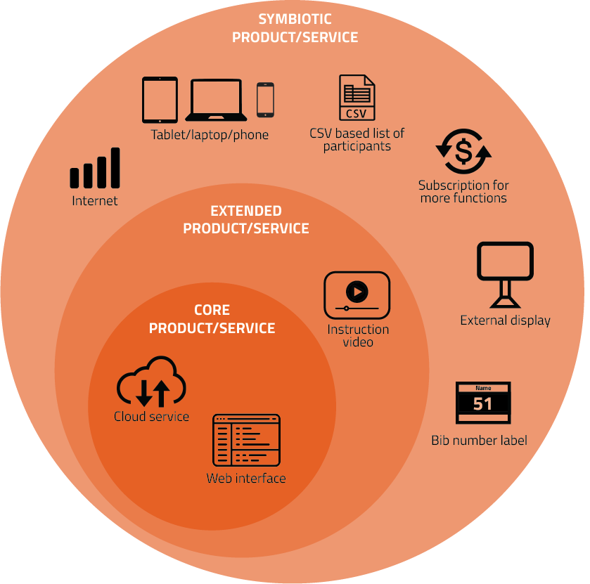
Digital buildup of RaveClocker
Core product
RaceClocker is a Software as a Service (SaaS) - also known as cloud-based
software. Instead of installing and maintaining software, users access it via the
internet. Besides, it uses a cloud service to store and transfer time tracked data.
Extended products
A 7 minutes instruction video on the RaceClocker homepage explains all the
functions available.
Symbiotic products
An internet connection is necessary when using this product. It enables
the transfer of real-time data. Since RaceClocker is a web-browser based
product, it can be used on multiple devices with an internet connection, such
as smartphone, tablet and laptop. A CSV based file of the participants list will
be helpful when the race manager wants to upload the participants list into
RaceClocker. Beside, a subscription is needed if users want to have more access
to functions and organize a race with more than 10 participants. Sometimes,
an external display is used for showing the countdown start time for sporters
and sharing the live results with the audience. Since RaceClocker doesn’t include
chips, bib or bow number labels are a way to recognise participants.
A bib number is also known as competition number, it is printed on a label which
can be attached to the participants’ clothes or gear.
Luckily we had the chance to
experience a real race and cooperate
with race organizers while observing
a rowing race process.
Two rowing races from DDS, a
rowing association in Delft, were
observed. One of us experienced the
process of being a timekeeper and
using RaceClocker in a real scenario.
There were three starting laps of 10
participants, varying from single to
four-men boats.
Based on our race experience, a
journey map was made, to analyse the
process and identify the pain points.
Observation on site
Based on the experience and the
journey map, there are several insights
that we found.
The race manager explained
that timekeepers prefer to use a
smartphone when recording time.
Furthermore the smartphone will be
held ‘landscape’ as this enlarges the
buttons, making exact timing easier.
Preferably two timekeepers are
present at one split point, one
timekeeper will shout out loud the
exact moment the boat passes
the split point, enabling the other
timekeeper to look at the phone and
press the button right away.
We were
advised to zoom into one button as
much as possible, making clicking
easier and preventing ourselves from
making mistakes.
As this race was a small-scale event,
all timekeepers knew participants
personally, in this case the use of BOW
numbers was not necessary.
Using
the phone for timing is preferred,
however it is somewhat limiting as
communication with race managers
or other timekeepers is not possible.
Besides the missing ability to
communicate, timekeepers also get
easily distracted as personal phone
notifications such as messages or
calls will interfere with the use of
RaceClocker.
When tracking times a
form of feedback whether time has
been tracked is limited.
We noticed that within the process of
time-keeping, there are 3 dimensions
that timekeepers need to pay attention
to. At the specific moment of timing,
a timekeeper has to pay attention to
the boat coming (physical), focus on
the phone (digital) to make sure one
presses the right button and keep
paying attention to press at the exact
moment the boat passes the timing
point.
Visualization of interaction required while timing
Therefore it is important
to have
control as a timekeeper over these
three dimensions in both the physical
and digital world intuitively. It is
necessary to input information in the
system with confident.
Within the use of RaceClocker
we acknowledge two main phases. The
first phase
includes the race preparation, in which a race manager enters all of the race
details relevant within the race by creating the race on a laptop. Such as, the
location, date and time, sport type, but also a participant list and details. After
that, links to the timers will be shared with time keepers, to enable them to keep
track of time during the race. The
second phase is the actual race, here we know
direct users and indirect users. The race manager is, in most cases, present at
the
start of the race. Using a laptop, the race manager is able to keep an overview of
the race. The timer dashboard gives the race manager the ability to see to which
participants a time has been assigned. Timekeepers are the ones in the field, who
assign times to the racers possible in different timing settings. Finally the race
manager is able to share an overview of live results, if needed on a large screen,
in order to make sure that racers and audience can view results live and directly
during and after the race.
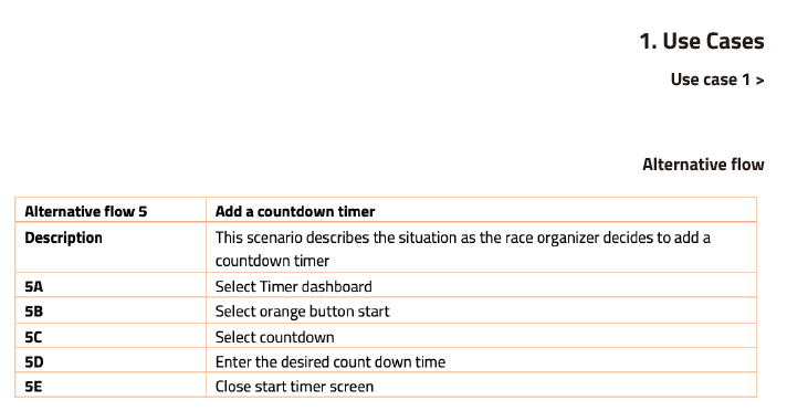
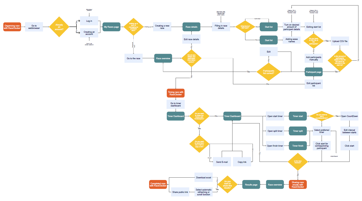
Functions of RaceClocker
As mentioned on the previous pages, we identified two main
phases for the use
of race clocker. For each phase an use case has been constituted to create insights in
the
intended user flow.
These use cases were used to create a flow diagram. The flow
diagram shows
in
more detail in what way a user can navigate back and forth through the website.
After understanding RaceClocker from different aspects, we did some other research
activities to evaluate the product in terms of user experience and usability. The main takeaways are
summarized below.
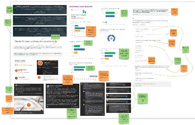
The user experiences are researched by comparing and
evaluating
different
reviews left on Facebook, Google or in the SurveyMonkey conducted by RaceClocker itself.
A lot of reviews are positive in general, which can be seen as a good sign for overall
design, however, is not that helpful for further improvements. From
our talk with the client, we knew that the founder is
eager to get more critical feedbacks. So, we still need to use other ways to
pinpoint the redesign opportunities.
Review analysis
In order to verify our product analysis and gain new insights about the
usability of RaceClocker and the routines of organizing a race, we interviewed a regular
user of RaceClocker, the chairwoman of the Asser Rowing Club.
According to the interviewee, timekeepers in her rowing club do not have a
device preference for timing. The first-time timekeepers usually have time to explore all
available functionsbefore the race starts. The list view is the most preferred time mode
because more participant information is visible.
The interviewee likes this
product because it considers a lot of details in a sports race, such as the countdown
start time, wave starts option and handicap factors. Besides, it can be used on
every timekeeper’s phone, which makes the use of RaceClocker easily accessible.
However, according to this regular user, there is still room for
improvement. For instance, the list of participants has formatting restrictions. There is
also a lack of data linkage. When changes are made during the race, the organizer needs to
communicate with timekeepers via other platforms. Moreover, the session timeout is limiting.
Users get automatically logged out after 5 minutes of inactivity.
The feedback we got was quite constructive. However, according to our talk with the client, the focus of our redesign
should be on the mobile version of this service, which made most of the feedback from the
interview peripheral. Therefore, we decided to conduct a methodical usage inspection on the
phone.
Usage Inspection
The main goal of holding our user test is to obtain a more thorough understanding of
the product regarding usability (the effectiveness, efficiency, and satisfaction of achieving
specified goals) to identify and prioritize issues and determine design opportunities to improve the
current design.
Research Questions We formulated the following research questions
to
guide the development of the user test plan.
Pattern of Use
How do users interact with RaceClocker and the phases users go through when
completing specific tasks?
User Performance
How well and how easily do users achieve their goals by using the product?
User Experience
How is the overall user experience of the current design?
Issues
What are the usage strengths or weaknesses of current design?
Sources
What caused the aforementioned issues?
Severity of Problems
How severe (how often/how badly/how long/external effects) are the problems?
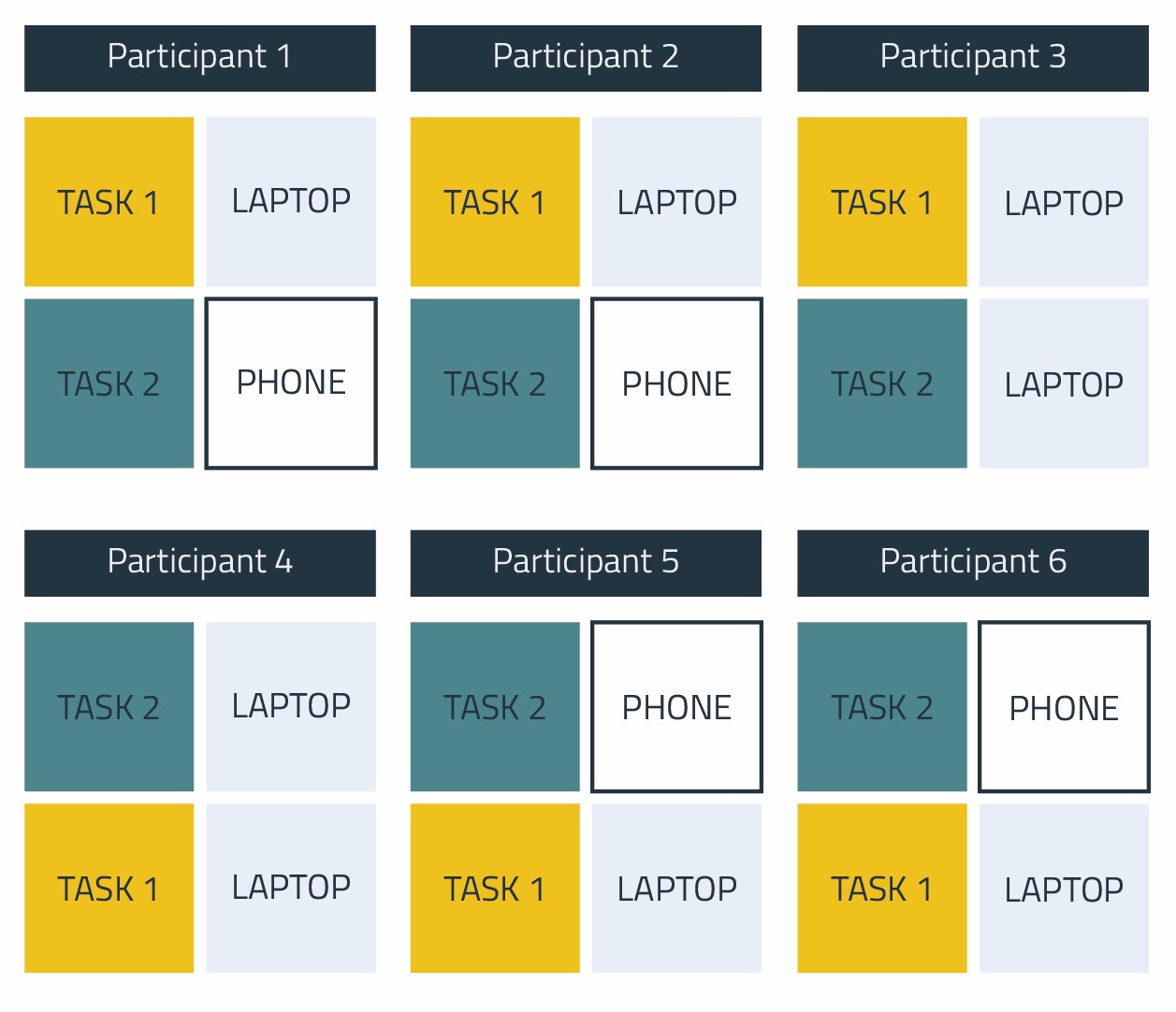
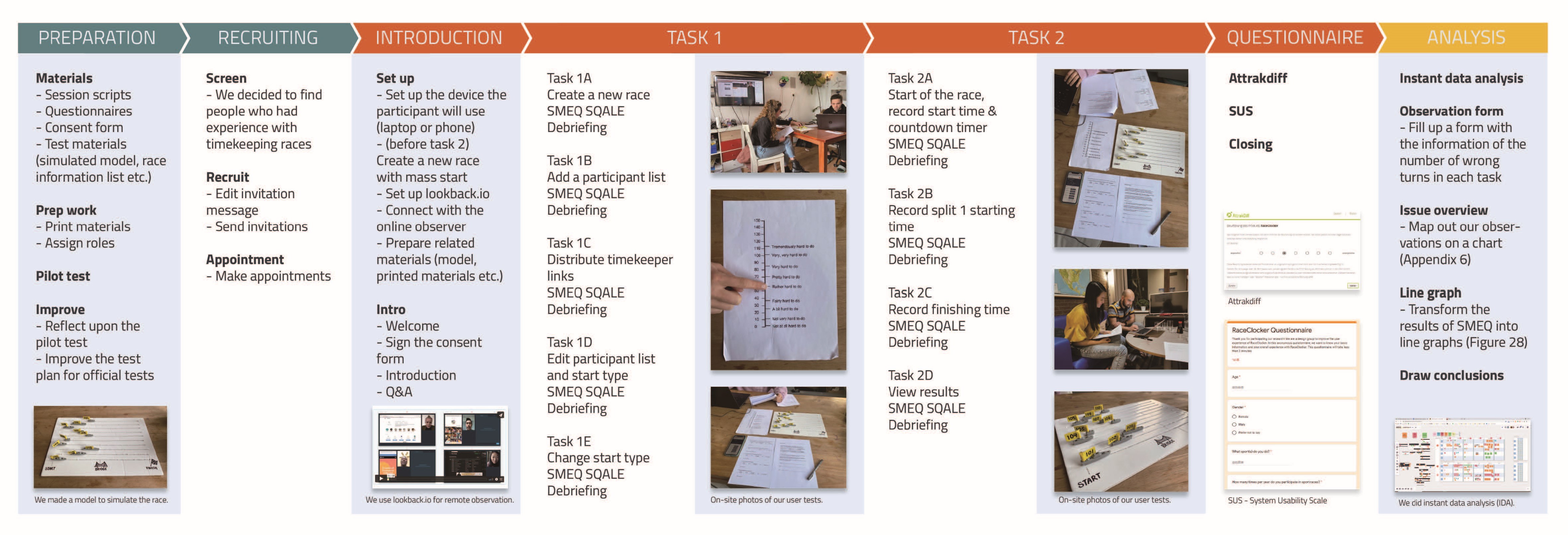
Set up
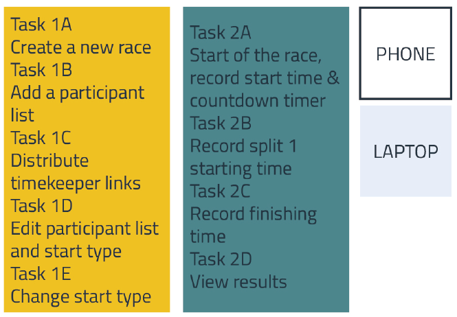
We recruited 6 participants for our user tests. Three of them are familiar with sport races and
have some basic knowledge about timing. The user test consists of two main tasks, each of which
has several sub-tasks. Here is the detailed literal instruction
sheet.Both
tasks are based on the use cases. Task one is focussed on the
creation and preparation of the
race, while task two is a simulation of the race itself.
A detailed scenario is written and read out loud to ensure that the execution of each test is
similar. The schematic process diagram illustrates the process of preparation, execution and
analysis for the user tests.
Description of the tasks
Roles
We assign different responsibilities to different roles such as facilitators, moderators, and
observers during the tests. We use lookback.io for remote observation.
Settings
We use a controlled setting to conduct the test. Participants use either a laptop or a mobile
phone. We deliberately randomize the task sequence and change the type of device to perform the
tasks. We assume that race managers will only use laptops in preparation of the race, therefore
task 1 will always be performed on a laptop. A visual simulation of the race is used for task
two.
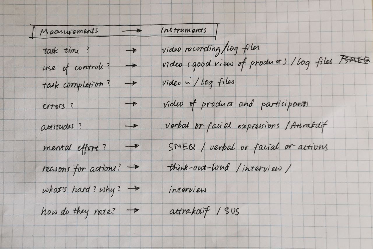
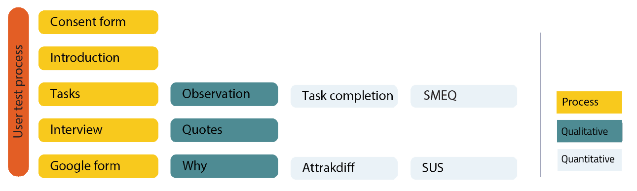
Methods
Various methods are used to collect qualitative and quantitative data. We used observation, thinking aloud, debriefing
interviews to collect qualitative data. For quantitative data, we use a SMEQ, Subjective Mental
Effort Questionnaire: a single question with a rating scale from zero to 150 which
stands
for
the difficulty level, and participants are asked to rate the difficulty of each task.
Attrakdiff (An instrument for measuring the
attractiveness
of an interactive product) and SUS
(Software Usability Scale: a questionnaire
that is used to
evaluate the usability of products and services)are used after the whole user test to
measure
perception satisfaction. Additionally, cthe amount of
wrong turns for each task are
calculated.
From measurements to instruments
Results
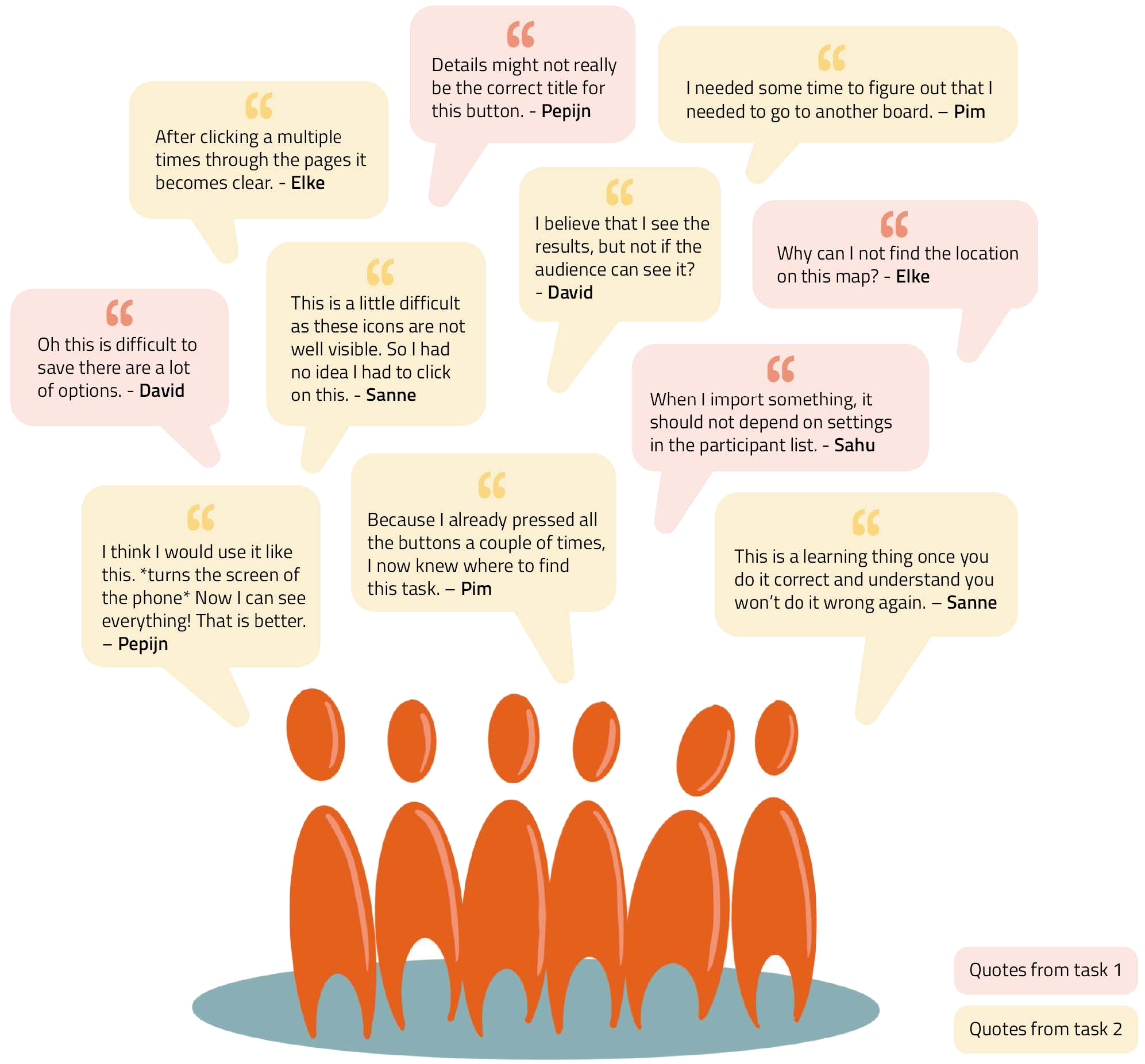
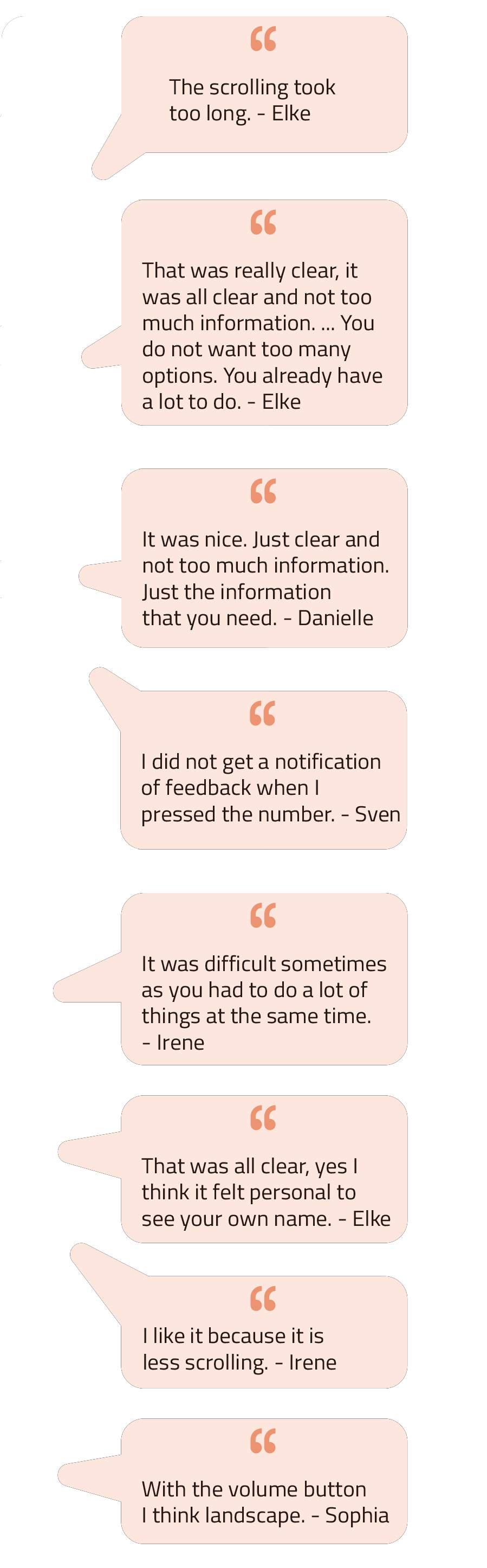
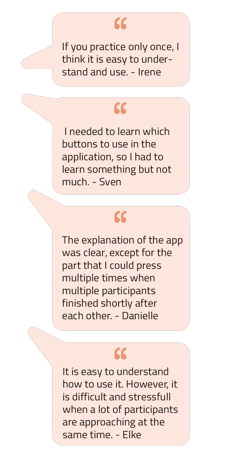
After testing, some meaningful
quotes were highlighted as important
references.
Quotes from usage inspection
Answers to the research questions
Pattern of Use
How do users interact with RaceClocker and the phases users go through when
completing specific tasks?
User Performance
According to our observations, we found that the most wrong turns happen in
Task 2A (10 times) - start of the race, record start time & countdown timer, followed by
Task 1B (7 times) - add a participant list, then followed by Task 2C (3 times) - record the
finish time.
User Experience
We synthesized the results of the SMEQ into a line graph. In this graph, we
rate the difficulty level according to the scores. The score from 0 to 50 is categorized as
easy, from 50 to 100 as medium, and from 100 to 150 as difficult. We can see from the graph
that most people considered task 1 to be simple to complete, whereas task 2 differs in
difficulty from person to person. With the above summary of issues in mind, we came to the conclusion that task 2 has the
most issues and, as a result, needs more effort in terms of redesign.
We analyzed the issues and identified the sources. Please refer to the next
part (problem statements) for more information.
Smeq scale graph
Scope
The current timing tool RaceClocker consists of three use phases: (1) Preparing the race as a race
manager, (2) timing the racers as a timekeeper and after the race, (3) sharing and viewing the race
results for both race managers, time keepers, audiences and many others. After evaluating the usability of RaceClocker, we
decided to focus on the second phase, keeping track of time during a race. Since we discovered
this timing phase has an important impact on a sports race.
Scope of redesign
scope
Design Space
The scope states the focus for redesigning RaceClocker. In view of the severity of the
problems and the results they might cause, we propose to divide the scope into three categories, the
primary, extended and passive spaces. The issues we identified through previous research are categorized
below.
Design space
goal
Bridge the gap between digital timing and physical tracking
“ We want to make frequent users feel in control when using RaceClocker. Time
recording
during a race should be intuitive, efficient, and fast. Besides that, users should feel confident when
using and navigating through the functions RaceClocker offers. “
Design criteria
The design criteria serve as a North Star for the later conceptualization process. They
provide the whole group with solid ground to move on and help gain alignment and drive decision-making.
We intended to make the criteria as measurable
and operational as possible.
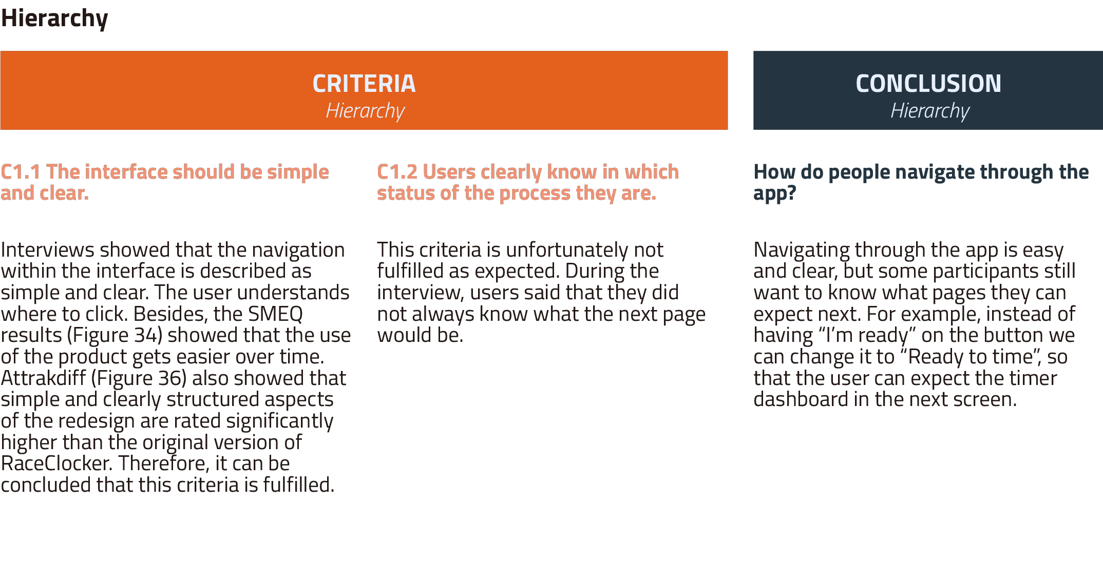
Hierarchy
- The interface should be simple and clear.
- Users clearly know which status of the process flow they are.
Use Flow
- The layout of the interface should comply with conventional using habits, which
means it should be logical and intuitive for users.
- The interface system should be flexible and adjusted to the preference of the user.
- The amount of functions for the timekeepers needs to be decreased.
- The right information needs to be given at the right time.
Feedback
- Users should automatically get instant and correct feedback after each action.
Information Clarity
- Users can finish their tasks with RaceClocker without wrong attempts.
- The meaning of the buttons is understandable for users without resorting to external
sources.
- The interface of the website should be readable and inclusive for people with visual
impairment.
Operations
- The product enables users to time the participants without having hand-eye
coordination problems.
- Users are able to undo the wrong action easily.
In order to have a smooth start with developing our own concepts, we first
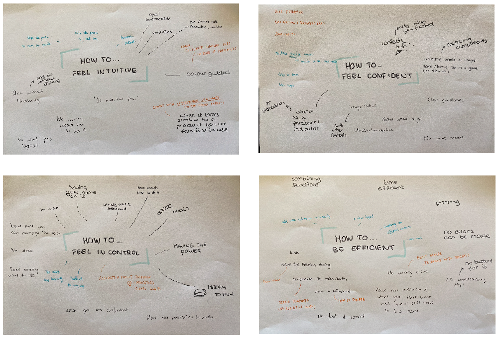
began with some plenary activities to get inspired. We started with ideating by
brainstorming for several How-Tos based on the five identified problems. We also created a
‘living frame’ on our Miro board to gather inspirational examples. Again we used the five
problem statements as a starting point.
Plenary how-tos
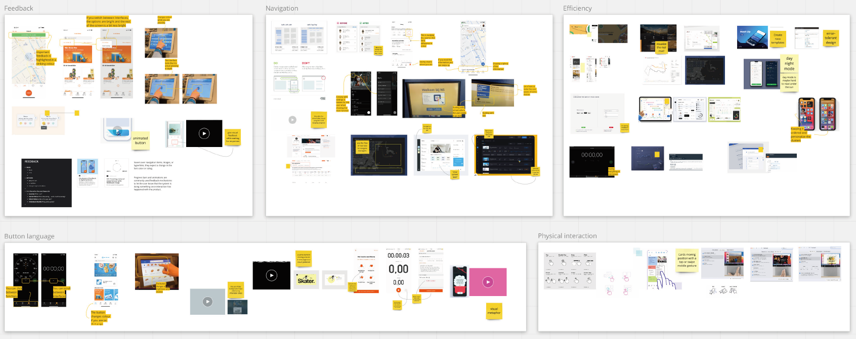
Inspirational case collection
Individual Ideas
With these five problem statements and several inspirational starting points, we
individually developed our design ideas to thoroughly explore the solution spaces. All
individual concepts are shortly described and visualized
here.
From ideas to concepts
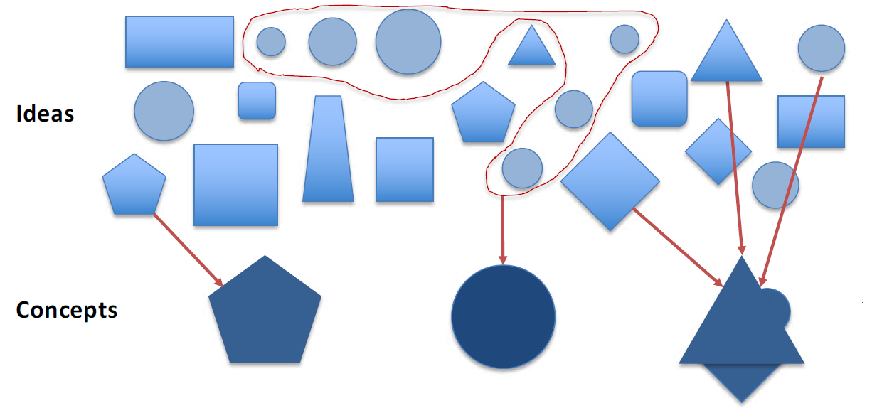
All of the individual concepts were discussed and introduced
to one
another. While doing so, quick notes were taken. Findings and opportunities were
discussed while keeping the design brief and scope in mind. Some incubation time was
planned to process all insights.
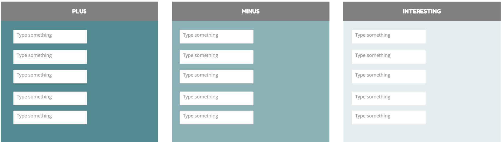
The process we based on
The PMI
(Plus/Minus/Interesting) method was used to evaluate all concept
directions. One by one, we noted down plusses, minuses, and interesting
aspects on cards on the Miro board. All of these cards were a starting point to
cluster all of the promising cards based on our scope. Click here to see all
individual concept cards.
PMI scheme
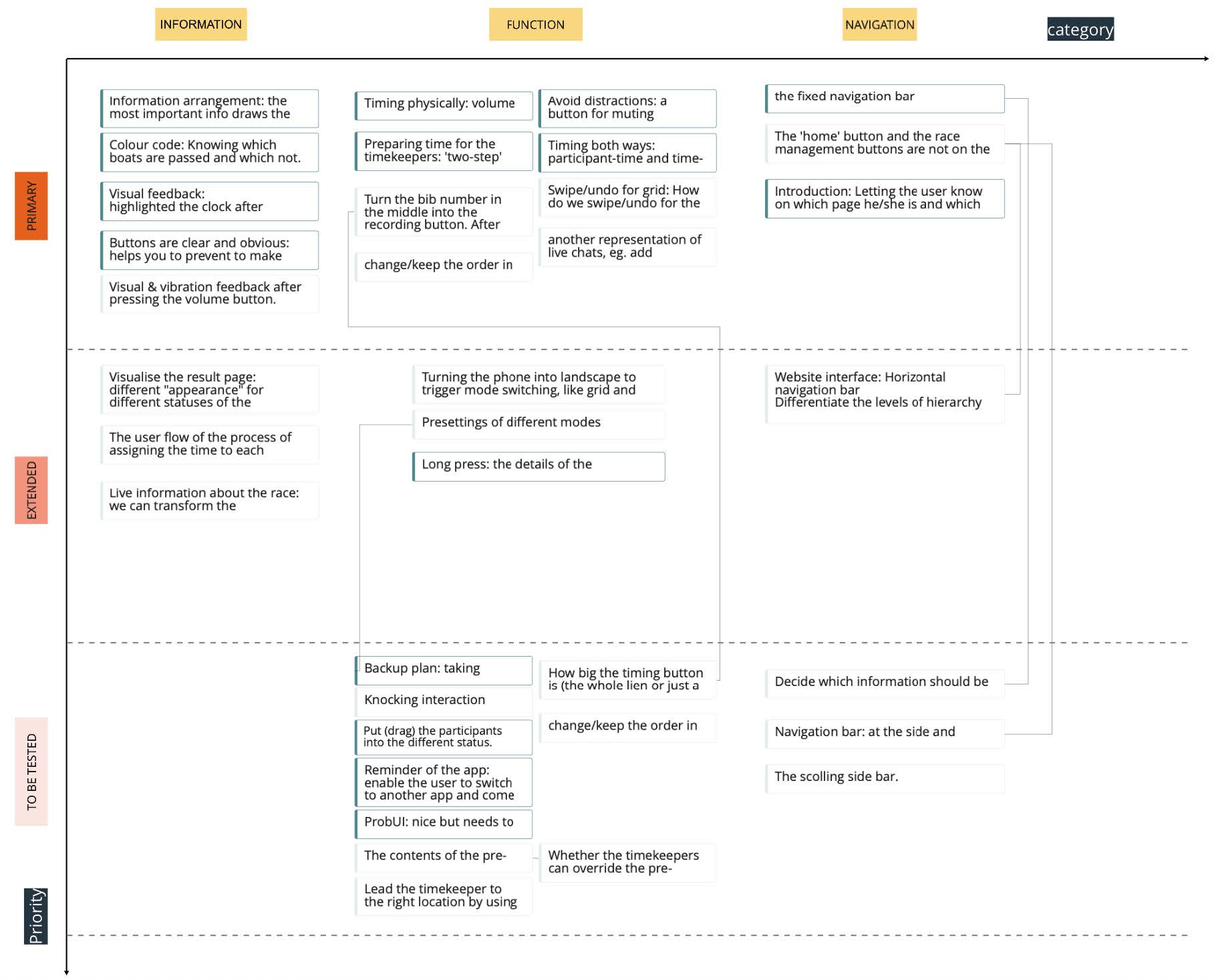
We organized the ideas into our primary and extended
redesign spaces (Y-axis).
Some really interesting but dubious ideas were labeled as to-be-tested. Horizontally we
clustered horizontally the PMI cards into three categories: information, function, and
navigation. These three categories were based on the previously defined inconvenience within
the current interface.
Clustering the cards of the PMI schemes from each
concept
Concept directions
Based on our criteria and individual design ideas, we set our design directions
to lead our design process. Some main design solutions are shown here. The complete
documentation of design directions can be found here.
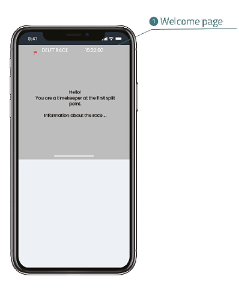
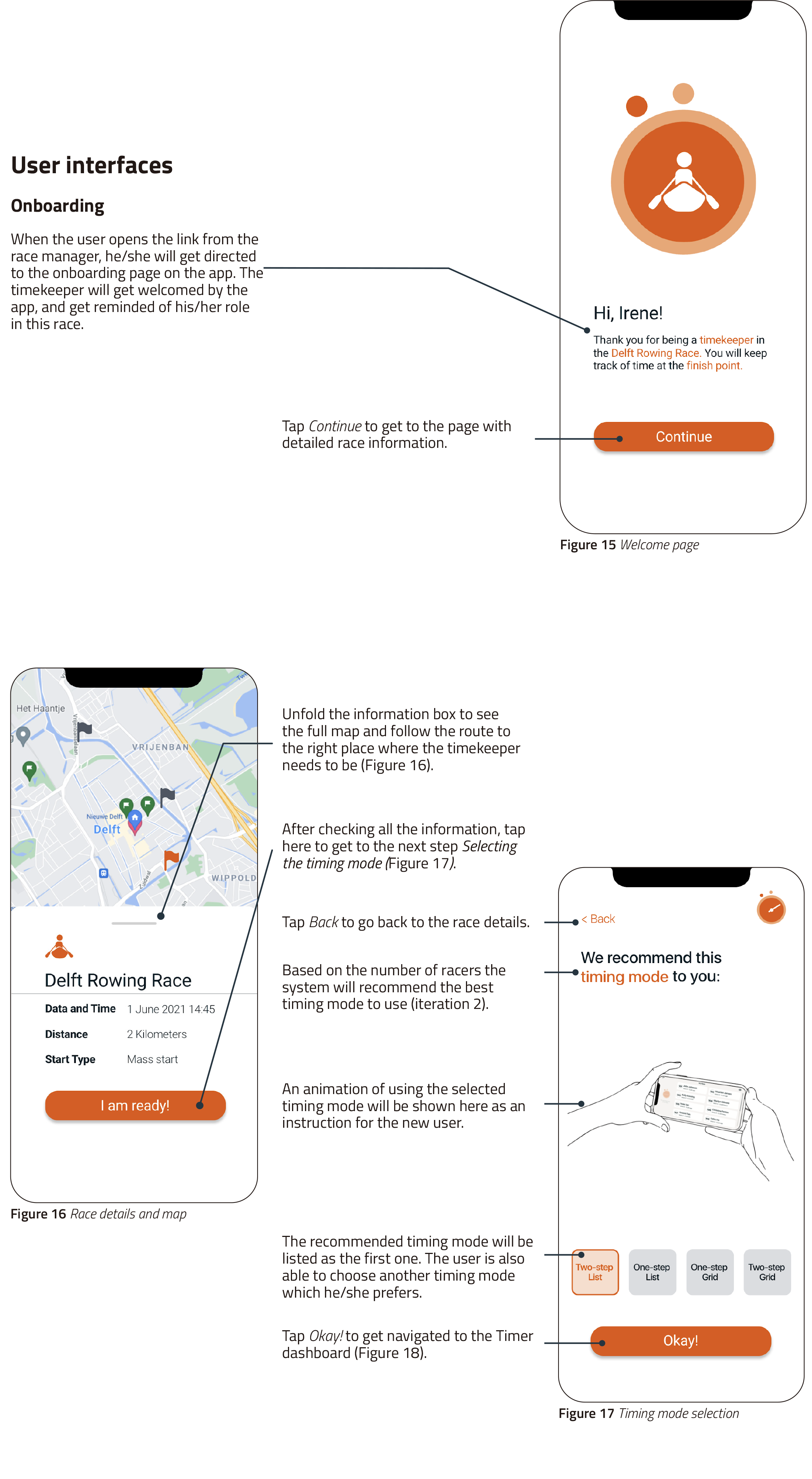
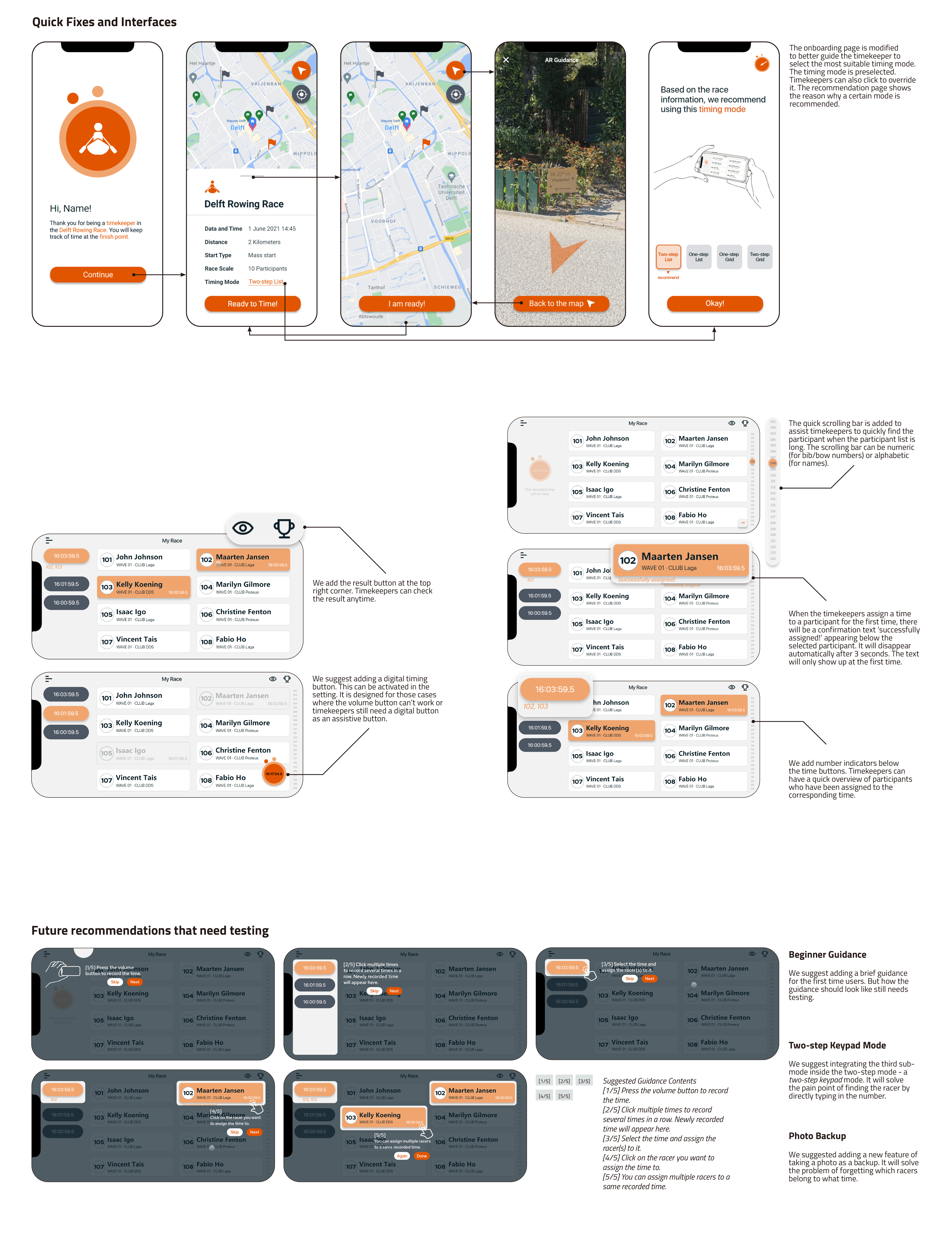
Smooth user flow
We intended to use the onboarding pages to simplify the use flow and make users
experience the whole process confidently. For example, by guiding the user to the timer
with a welcome page, the user receives more guidance and confidence will therefore
increase.
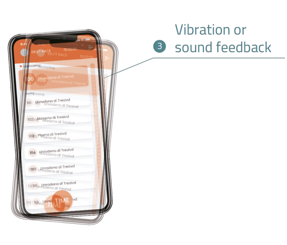
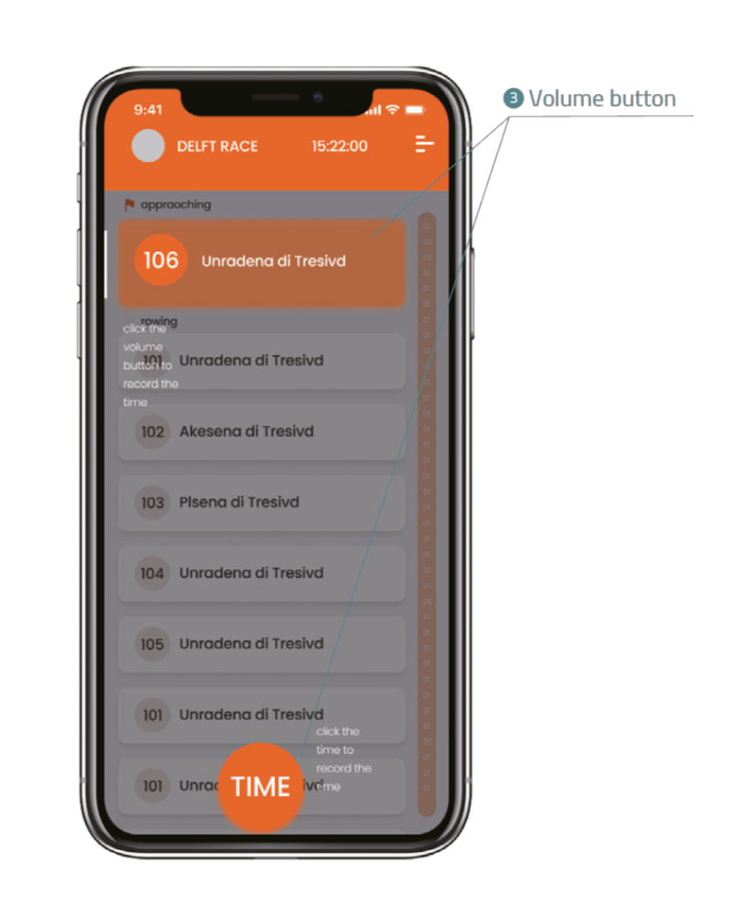
Physical interaction
To provide the most accurate time to timekeepers, we make full use of the physical
interaction in the phone including the volume button to record the time. Also, the
vibration feedback after timing provides haptic feedback to the timing of the user.
Combining them with the digital screen, a bridge between the digital world and the
physical world can be built.
Digital information
Due to the many changes in the interfaces for the user (e.g. racers who have been
assigned a time or races that did not pass the line yet), color codes will be used to
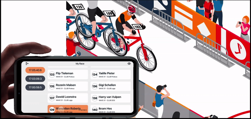
illustrate the different states. Landscape operation
The landscape will be the main mode for users to operate considering the multiple
elements in a race.
We use a stopwatch as a metaphor for our
redesign.
Because Raceclocker’s target races are those who are organized by some club's chips or
transponders
using a stopwatch to record time is the most natural and comfortable approach for timekeepers to
feel in charge. Interaction - Physical button
Physical interaction to record the time will strengthen the feeling of control and confidence
when
recording the time. As this gives the user the ability to track the times while looking at the
race,
instead of having a constant eye on the phone.
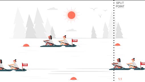
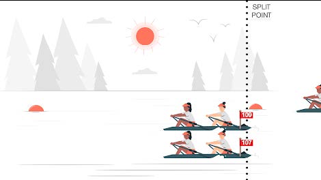
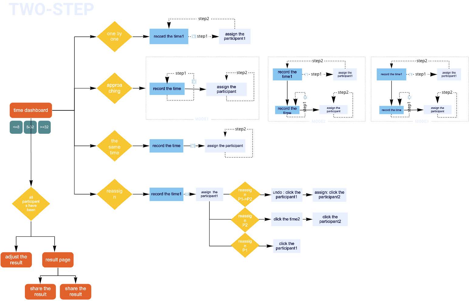
Flow- Time first
Instead of a one-button-click on the racer, we use a two-step way. Similar to using a stopwatch,
record the time and then assign this to the corresponding racer. Again giving the user the
ability
to track the time, keep their eyes on the race, and then assign it to the corresponding racers.
Stopwatch
solution
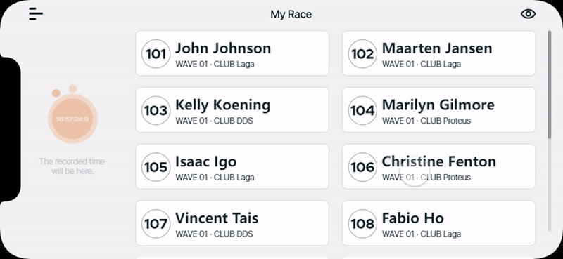
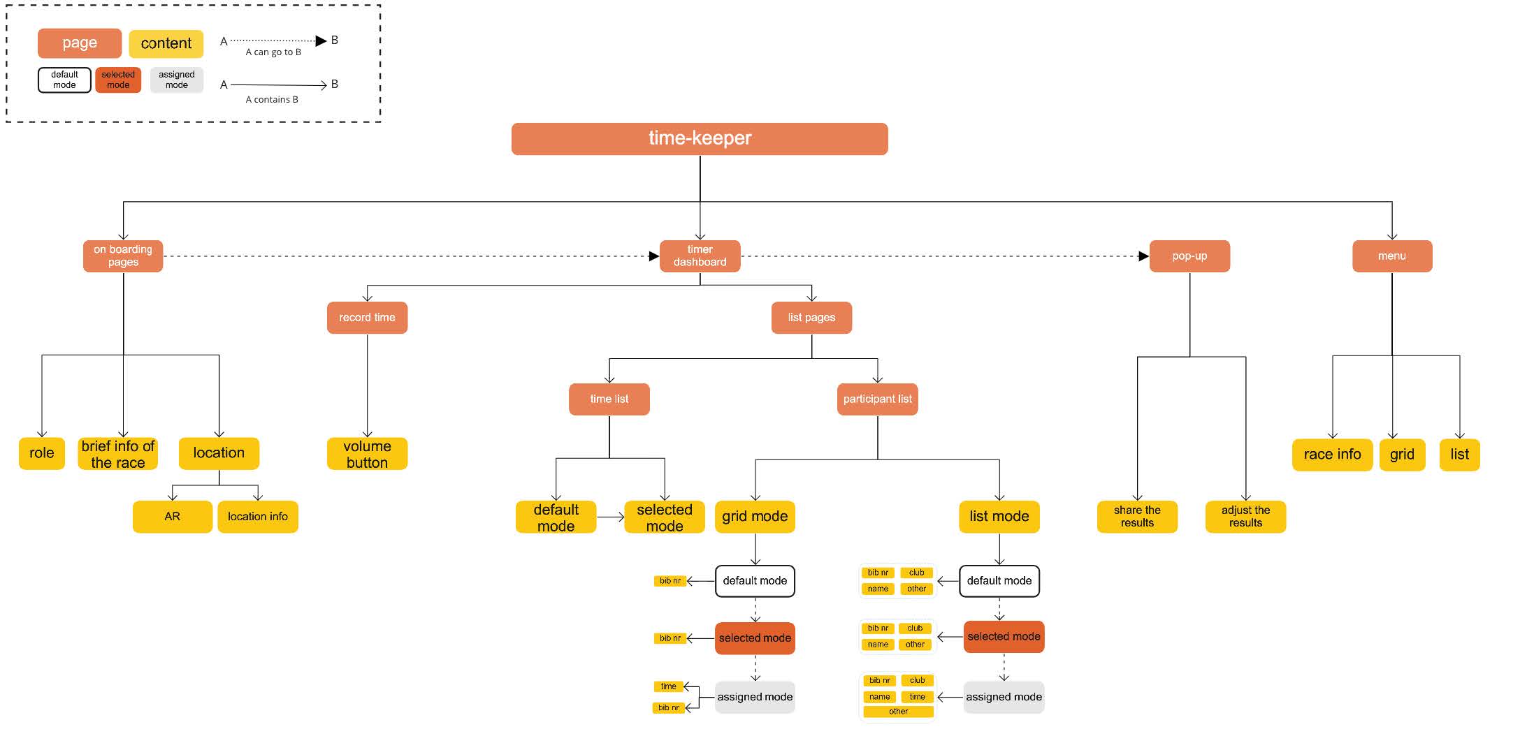
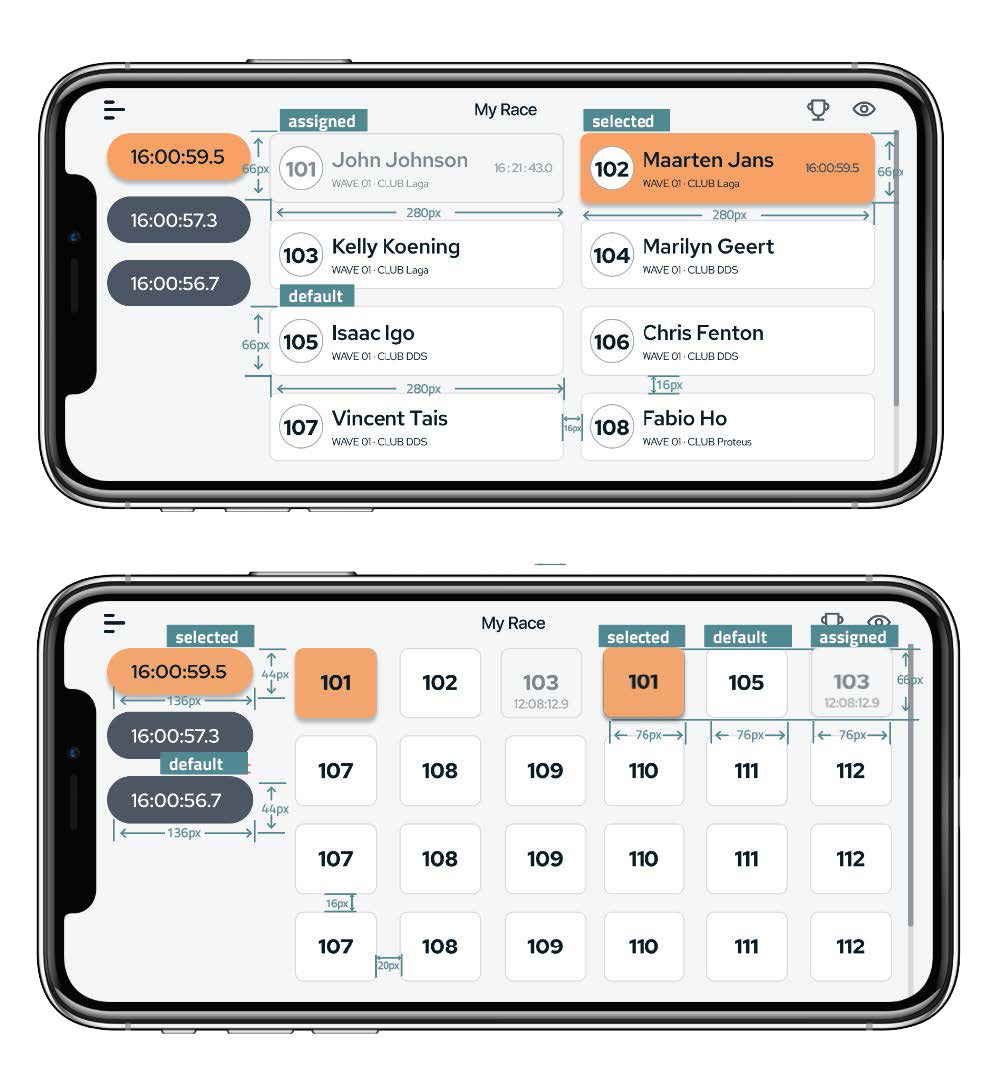
Flattened Information Architecture
We design the timekeeper’s information architecture and make it as simple as possible to let
the timekeeper focus on the recording time process.
To let users feel more in control and confident while tracking times in the race, we ensured
to
simplify the user flow and eliminate unnecessary steps. There are mainly two phases in the use flow:
going
to the right split point before the race and timing the racers during the race.
For recording time, we simplify the process
and divide the recording time action into “record time” and “assign racer” to fit different
scenarios. Different modes are available within the timer dashboard, like grid or list mode.
These modes are recommended for specific race types to meet the needs of the users.
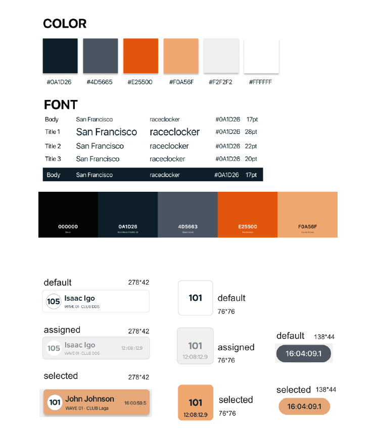
A design guideline was created in order to create a smooth and coherent style within
our redesign. The design guideline contains two parts: 1) the UI guideline; 2) the component
state guideline.
UI guidance
In the UI guideline, we followed Raceclocker’s original iconic orange to
maintain its energetic
visual style.
Component
To make full use of the screen space and improve the efficiency and accuracy of recording the
time, we carefully consider the dimensions and different states of each button.
Within the process of setting up our user tests, a pre-pilot and a pilot test have been
executed
before the official test. In total, we tested a pre-pilot with two participants, a pilot with one, and
the
final test with six participants. As for our scope, we
decided to focus on the timing part. The goal of these user tests is to evaluate our redesign
for
keeping track of time during the race.
Test Setup
Measurable criteria
We set up research questions for each design criterion and supplemented each criterion with
sub-criteria. We set up a user test to evaluate the redesign according to the criteria.
The test takes about 30/45 minutes per participant. Each
participant
executes the test
on a smartphone enabling optimal use of the prototype created in P*rotopie*. The user
test knows two
races. Race 1 simulates a small-scale rowing race event with ten racers. Race 2
simulates a bigger
cycling event with fifty racers. We chose to test
these two races because the number of racers in a race varies a lot and the size of the
race has
a great effect on the difficulty of timekeeping.The number of sizes was chosen based on
Raceclocker’s history data.
The test consists of three parts with a few sub-tasks. Part one is the rowing race and
part two and
three represent a cycling race. The facilitator will guide the participant through the
different
tasks with a session script. We pre-set a race and the participant will keep track of
the time
during this race by using our redesigned prototype of RaceClocker.
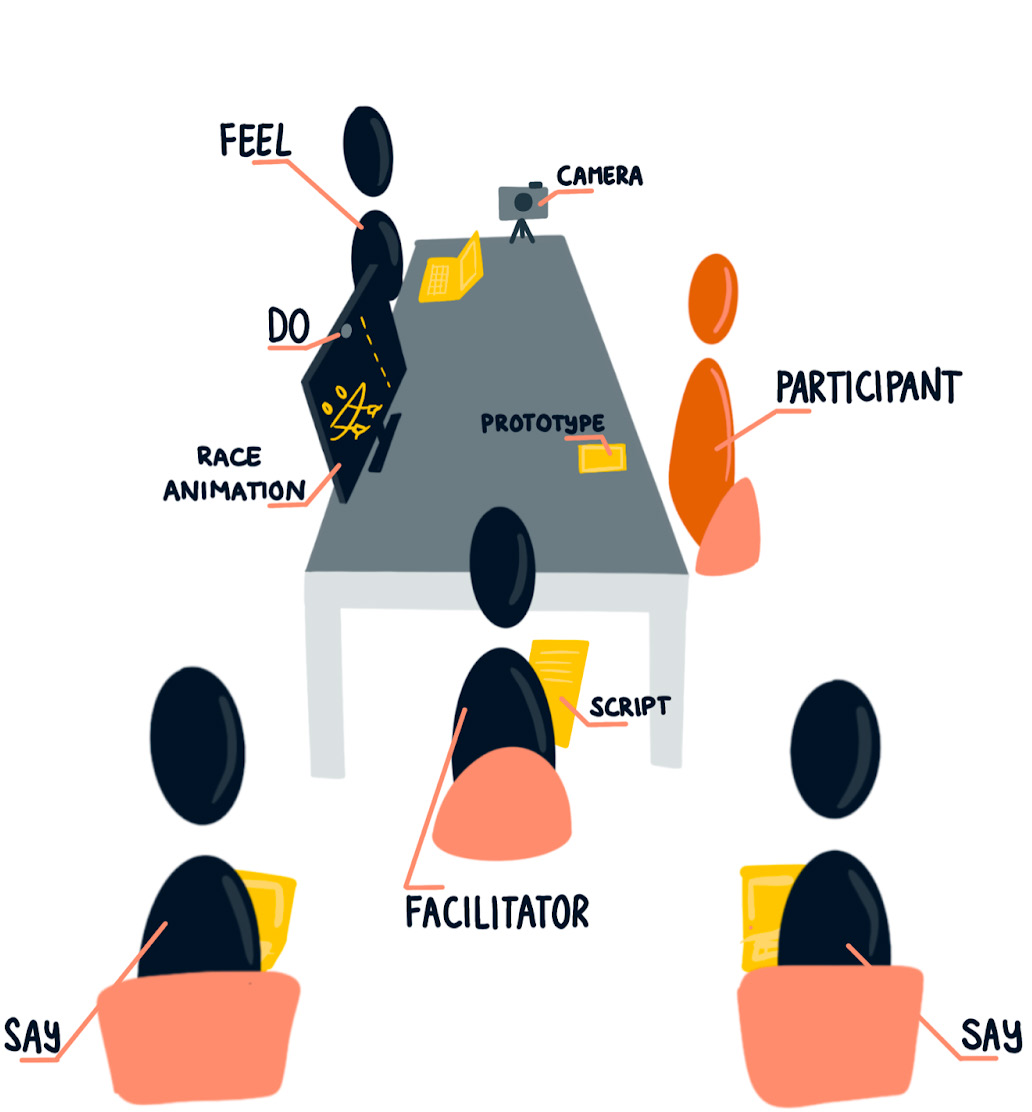
We conducted the user tests with all 5 of us,
each playing
a
different role.
The
facilitator is the leader of the user test and executes the test supported by a detailed
session
script. She sits closely next to the participant. Observer FEEL sits on the other side
of the table,
diagonally opposite to the participant, to note down how the participant behaves and
what kind of
emotions he or she expresses. Observer DO is observing online, via
lookback.io to see how the
participant interacts with
the interfaces of the prototype. The remaining two team members are acting as observers
SAY and sit
behind the facilitator to write down what the participant is saying.
Furthermore, the participant is asked to perform the tasks on the prototype. The race
animation on a
bigger screen simulates the race context. The whole session is recorded with a camera
and with
lookback.io as a backup.
Environment of the user test
Data collection methods
Thinking out loud
In advance, the participant is asked by the facilitator to share every thought on their
actions during
the tasks. The participant is assured that nothing is wrong and is requested to be honest
with the
feedback.
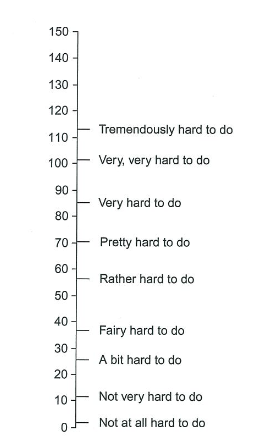
SMEQ
After each task, we asked the participant to rate the task difficulty on a rating method
that has
been found to be easy to use: the Subjective Mental Effort Questionnaire (SMEQ). It
consists of a
single scale with nine labels from “Not at all hard to do” to “Tremendously hard to do”.
Observing
During the user test we will have three types of observers. Observer SAY notes down what the
user says
during the session and how difficult each task is rated on the SMEQ scale. Observer FEEL
notes down how
the participant behaves and feels while performing the tasks. Observer DO notes down the
steps the user
takes within the prototype and how many attempts the user needs to complete the task.
Interview
After the tasks are completed, the facilitator asks some debriefing questions to discuss the
prototype
of RaceClocker.
Attrakdiff
Attrakdiff is a tool designed to understand how users rate a product or service’s
usability and
design. We used a part of this existing tool to let the participants rate our redesign
of
RaceClocker. Using the same scale as the
usage inspection before enables us to
make comparisons directly.
SUS
System Usability Scale (SUS) provides a quick and dirty reliable tool for measuring the
usability of
a product or service. It consists originally of 10 questions with five response options;
from
strongly disagree to strongly agree. We tested all 10 questions in the usage inspection
of
the current RaceClocker but found out
that not all five questions are relevant according to our design criteria. So we
shortened the
question list to suit our design criteria.
Results
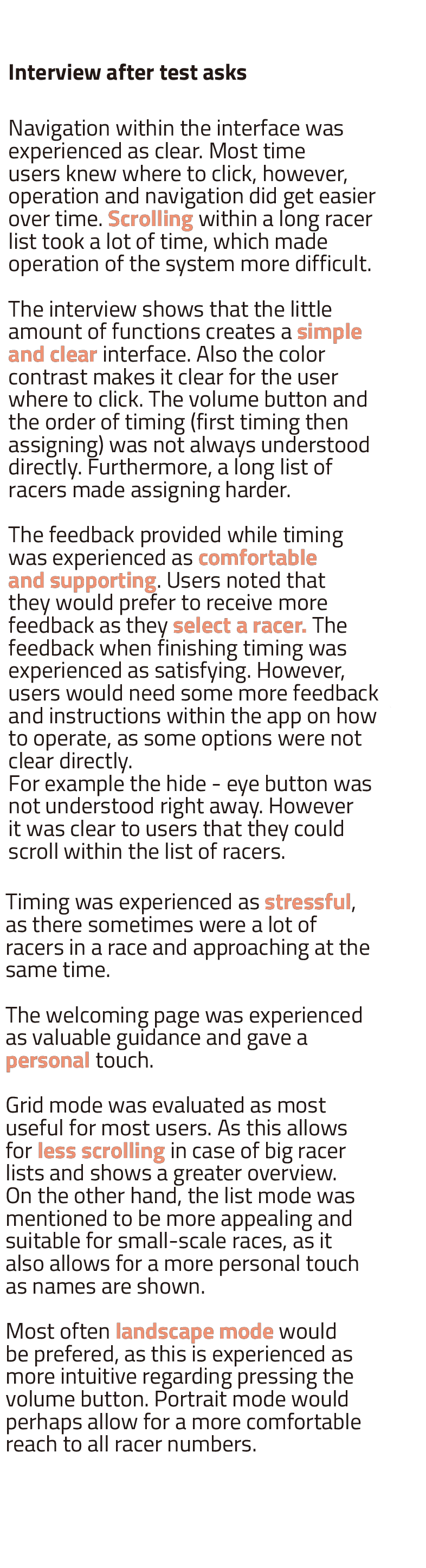
Observation
During each task, four team members took notes in different roles. All these notes were
combined in a big table in Miro to draw conclusions from. Observation notes, do say feel, showed us that
when users have to time a lot of racers, stress is experienced. Especially when all racers arrive at the
same time and close to one another. It was very clear
that the ease of use increased as more experience was gained.
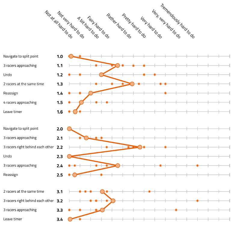
SMEQ
The figure below shows the rating of each task with the SMEQ scale. The small orange dots
represent the individual SMEQ scale rating of each participant, the big orange dots show the average of
all six participants for each task. From the SMEQ rate of 30 or higher, it has the label ‘a bit hard to
do’ and a few tasks are on or above this rating. Task 1.1, 1.2, 1.3, 2.2, 2.4, 3.1, 3.2, and 3.3 are
tasks with which the participants had trouble.
SMEQ result
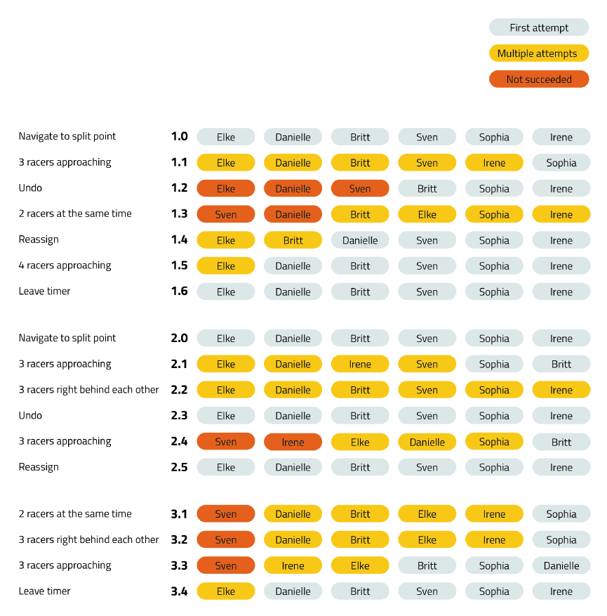
Task completion
The completion of each task is visualized below. Some participants didn’t succeed in
completing tasks 1.2, 1.3, 2.4, 3.1, 3.2, and 3.3. Furthermore, task 1.1, 1.4, 2.1 and 2.2 needed
multiple attempts to fulfill the job.
The task completion situation and SMEQ scale show a similar pattern.
Task completion situation
Interview
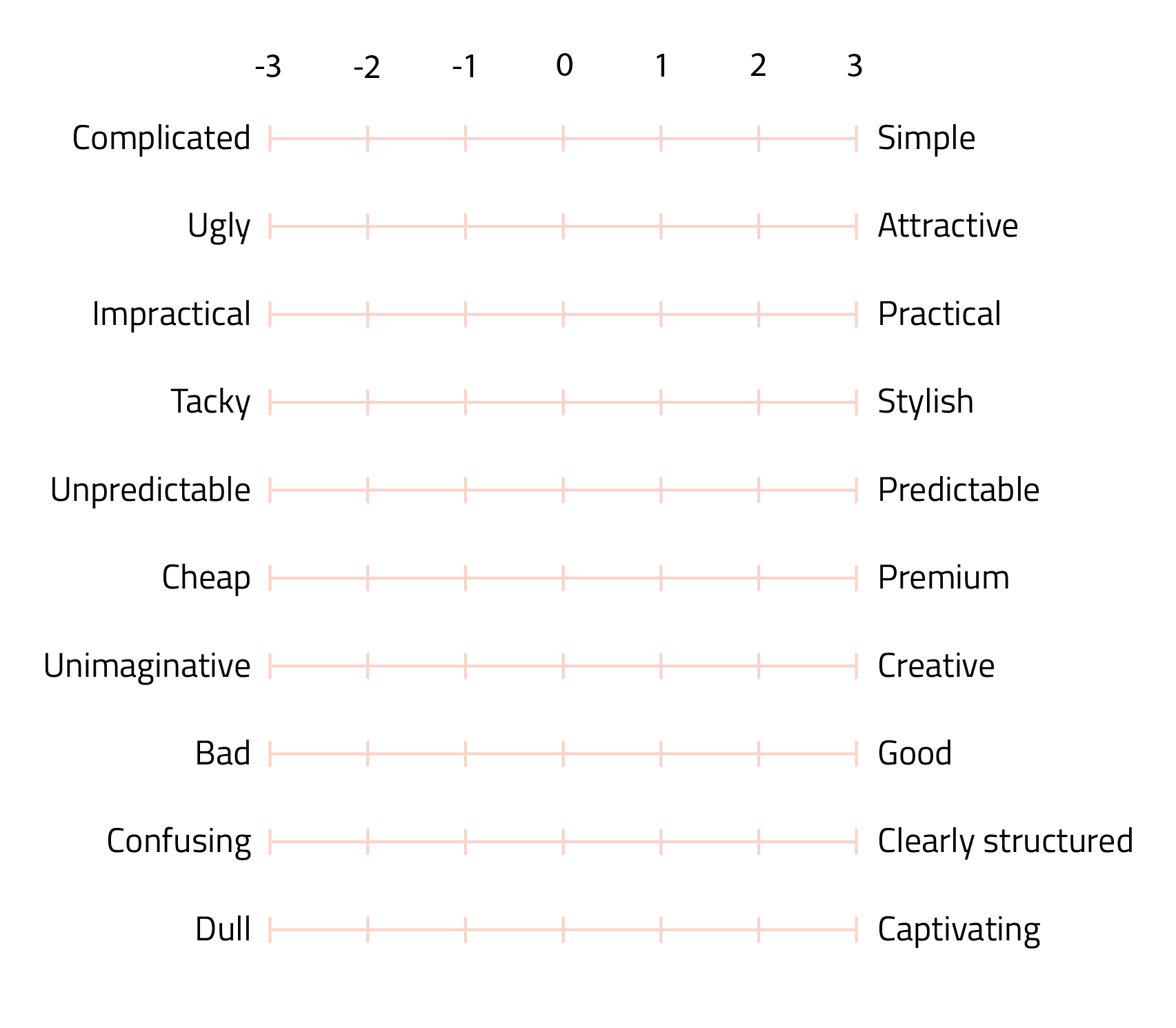
Attrakdiff
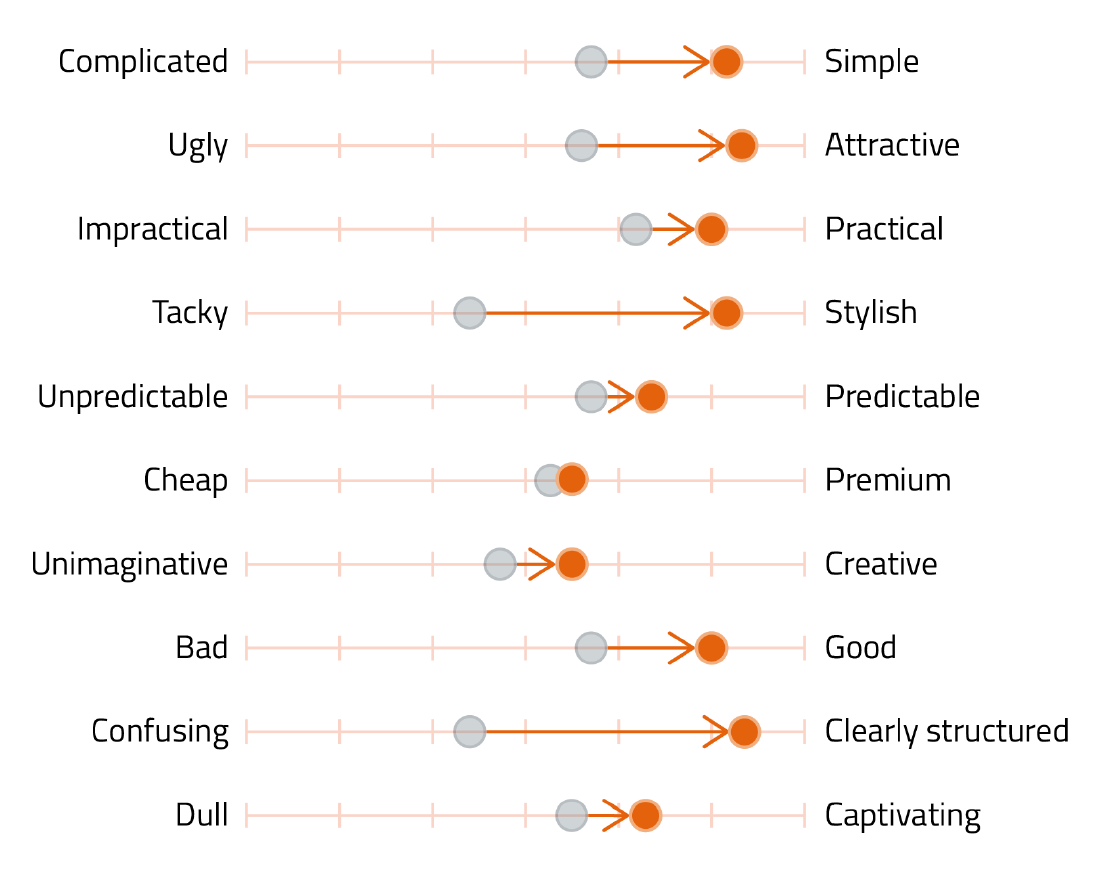
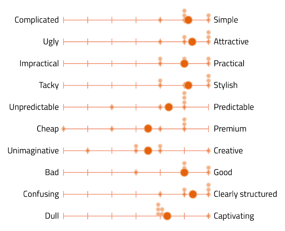
The results of the Attrakdiff questionnaire can be found in the figure, where the grey dots
represent the average ratings of the six participants in the user tests of the current
RaceClocker website. The orange dots are the average rating of our redesign by the six
participants of the user test.
The graph shows that on each level, the redesign is rated higher than the current RaceClocker.
The biggest differences can be seen in between the confusing-clearly structured scale and the
tacky-stylish scale. The slightest difference can be noticed in the cheap-expensive scale.
This figure shows the spread of the Attrakdiff score of the redesigned RaceClocker timer. The
spread of unpredictable-predictable, cheap-premium, and unimaginative-creative shows a wider
range compared to the other scales in this figure, while other dimensions clearly show obvious
improvements. If we compare this graphic to the last figure, we can see that the improvement in
these three scales is not as significant as it is in the other scales.
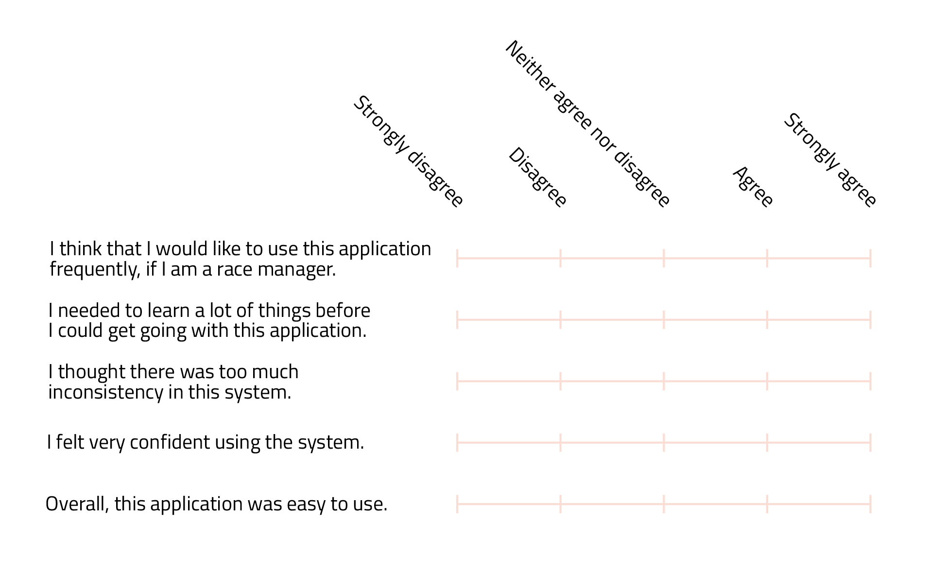
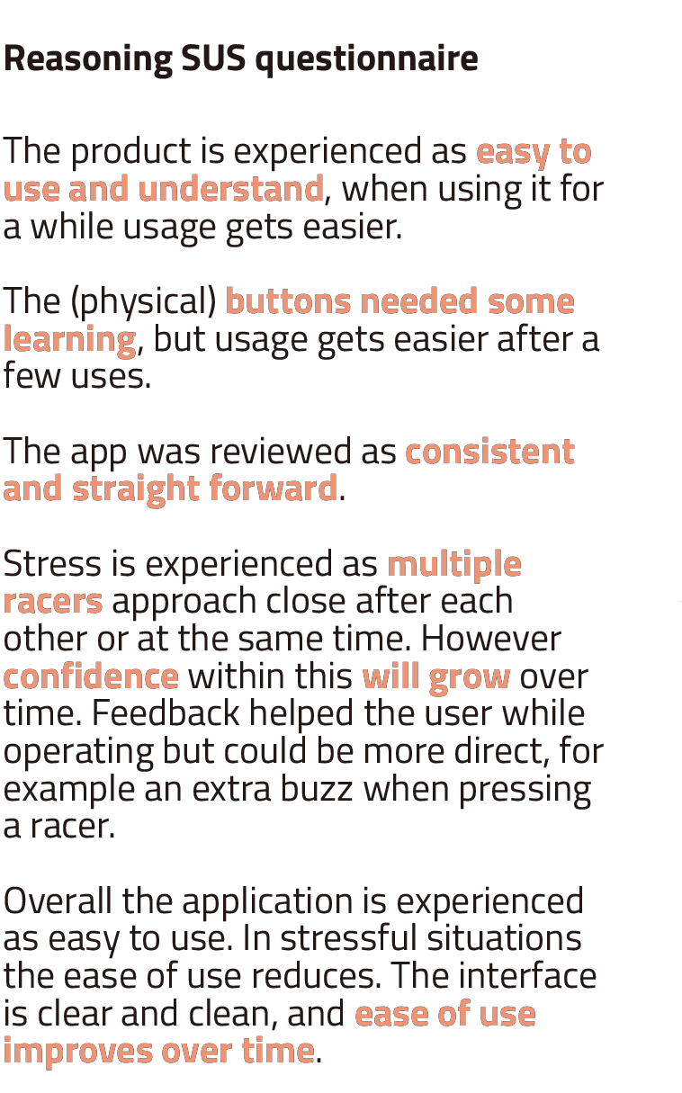
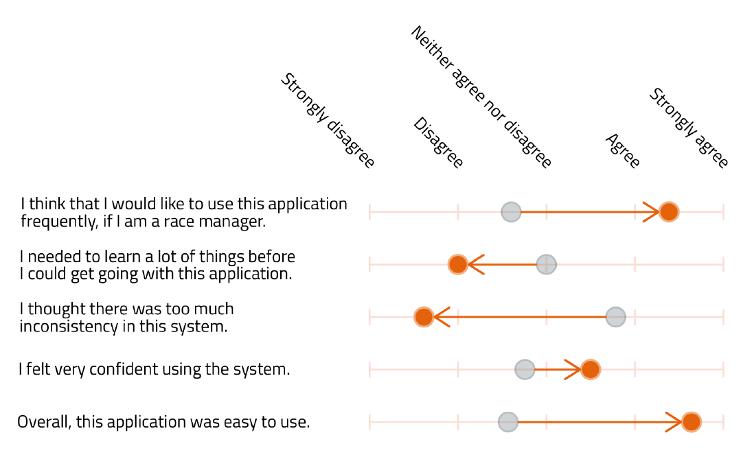
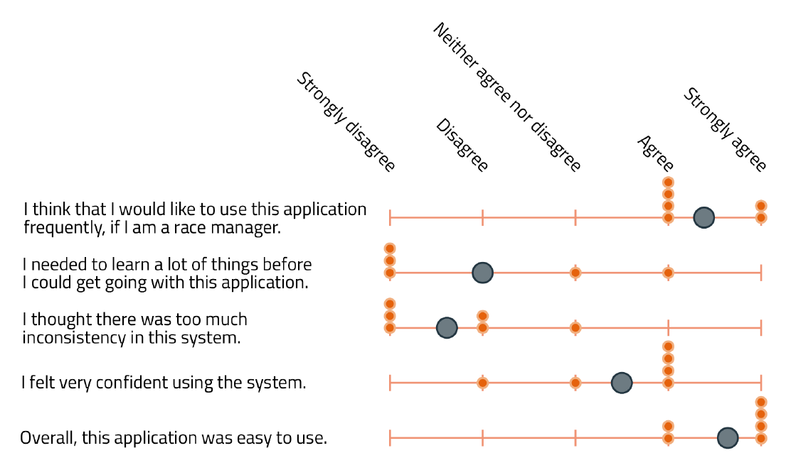
SUS
This figure shows the averages of the System Usability Scale, as known as SUS, of both the
current (grey) and redesigned (orange) RaceClocker. In all five statements, we see strong
improvements in comparison to the current RaceClocker. The participants could imagine using this
tool if they needed to track time during a race, found it easy to use, and were confident when
using the product. The system was really consistent and they had less to learn during the use of
the application in comparison to the current RaceClocker.
This figure shows the average rating for each SUS statement. No unexpected divergent ratings
have been given.
Criteria
Recommendations
If I had more time ...
Make a gradual optimization plan Drastic changes in design always risk
causing issues of adaption. If we had more time, we will design a
fine-grained optimization plan to gradually roll out the new features and diminish the backlash of the
new design.
Take technical constraints into account When we proposed to use the
physical button for quicker timing, our client favored this idea and
encouraged us to go for it. However, this feature probably needs to run on a standalone application
rather than a web-based service. This would bring up further discussion around the tradeoff between
making an application or still keeping it a web-based service.
What I have learned ...
Use frameworks to structure the research process. Doing domain research
like product analysis can be quite a big job. Using frameworks to manage
the research activities help cultivate a result-driven mindset and make the process clear.
Make every design decision intentionally. Even though many constraints have
been lifted in this project and bold design is encouraged, being bold doesn't mean being undeliberate.
We have been through three big or small iterations throughout this project, and we attempted to make
each of our design decision intentionally by documenting our
reasoning behind each step.